Data reclassification
Reclassifying data based on specific criteria is a common task when doing GIS analysis. The purpose of this lesson is to see how we can reclassify values based on some criteria which can be whatever, such as:
1. if travel time to my work is less than 30 minutes

    AND

    2. the rent of the apartment is less than 1000 € per month

    ------------------------------------------------------

    IF TRUE: ==> I go to view it and try to rent the apartment
    IF NOT TRUE: ==> I continue looking for something else
In this tutorial, we will:
Use classification schemes from the PySAL mapclassify library to classify travel times into multiple classes.
Create a custom classifier to classify travel times and distances in order to find out good locations to buy an apartment with these conditions:
good public transport accessibility to city center
bit further away from city center where the prices are presumably lower
Input data
We will use Travel Time Matrix data from Helsinki that contains travel time and distance information for routes between all 250 m x 250 m grid cell centroids (n = 13231) in the Capital Region of Helsinki by walking, cycling, public transportation and car.
In this tutorial, we will use the geojson file generated in the previous section:
"data/TravelTimes_to_5975375_RailwayStation_Helsinki.geojson"
Alternatively, you can re-download L4 data and use "data/Travel_times_to_5975375_RailwayStation.shp" as input file in here.
Common classifiers
Classification schemes for thematic maps
PySAL -module is an extensive Python library for spatial analysis. It also includes all of the most common data classifiers that are used commonly e.g. when visualizing data. Available map classifiers in pysal’s mapclassify -module:
Box_Plot
Equal_Interval
Fisher_Jenks
Fisher_Jenks_Sampled
HeadTail_Breaks
Jenks_Caspall
Jenks_Caspall_Forced
Jenks_Caspall_Sampled
Max_P_Classifier
Maximum_Breaks
Natural_Breaks
Quantiles
Percentiles
Std_Mean
User_Defined
First, we need to read our Travel Time data from Helsinki:
import geopandas as gpd

fp = "data/TravelTimes_to_5975375_RailwayStation_Helsinki.geojson"

# Read the GeoJSON file similarly as Shapefile
acc = gpd.read_file(fp)

# Let's see what we have
print(acc.head(2))
   car_m_d  car_m_t  car_r_d  car_r_t  from_id  pt_m_d  pt_m_t  pt_m_tt  \
0    29476       41    29483       46  5876274   29990      76       95
1    29456       41    29462       46  5876275   29866      74       95

   pt_r_d  pt_r_t  pt_r_tt    to_id  walk_d  walk_t    GML_ID   NAMEFIN  \
0   24984      77       99  5975375   25532     365  27517366  Helsinki
1   24860      75       93  5975375   25408     363  27517366  Helsinki

       NAMESWE NATCODE                                           geometry
0  Helsingfors     091  POLYGON ((402250.000 6685750.000, 402024.224 6...
1  Helsingfors     091  POLYGON ((402367.890 6685750.000, 402250.000 6...
As we can see, there are plenty of different variables (see from here the description for all attributes) but what we are interested in are columns called pt_r_tt which is telling the time in minutes that it takes to reach city center from different parts of the city, and walk_d that tells the network distance by roads to reach city center from different parts of the city (almost equal to Euclidian distance).
The NoData values are presented with value -1.
Thus we need to remove the No Data values first.
# Include only data that is above or equal to 0
acc = acc.loc[acc['pt_r_tt'] >=0]
Let’s plot the data and see how it looks like
cmapparameter defines the color map. Read more about choosing colormaps in matplotlibschemeoption scales the colors according to a classification scheme (requiresmapclassifymodule to be installed):
%matplotlib inline
import matplotlib.pyplot as plt

# Plot using 9 classes and classify the values using "Natural Breaks" classification
acc.plot(column="pt_r_tt", scheme="Natural_Breaks", k=9, cmap="RdYlBu", linewidth=0, legend=True)

# Use tight layout
plt.tight_layout()
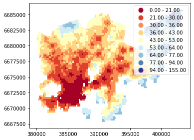
As we can see from this map, the travel times are lower in the south where the city center is located but there are some areas of “good” accessibility also in some other areas (where the color is red).
Let’s also make a plot about walking distances:
# Plot walking distance
acc.plot(column="walk_d", scheme="Natural_Breaks", k=9, cmap="RdYlBu", linewidth=0, legend=True)

# Use tight layour
plt.tight_layout()
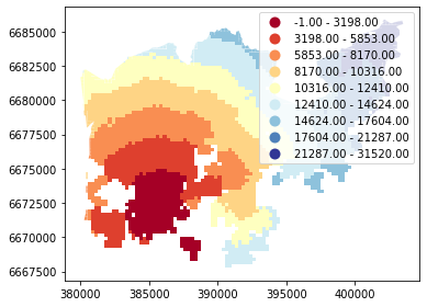
Okay, from here we can see that the walking distances (along road network) reminds more or less Euclidian distances.
Applying classifiers to data
As mentioned, the scheme option defines the classification scheme using pysal/mapclassify. Let’s have a closer look at how these classifiers work.
import mapclassify
Natural Breaks
mapclassify.NaturalBreaks(y=acc['pt_r_tt'], k=9)
               NaturalBreaks

 Lower            Upper               Count
===========================================
          x[i] <=  22.000               290
 22.000 < x[i] <=  31.000               586
 31.000 < x[i] <=  38.000               789
 38.000 < x[i] <=  45.000               820
 45.000 < x[i] <=  53.000               480
 53.000 < x[i] <=  63.000               356
 63.000 < x[i] <=  77.000               255
 77.000 < x[i] <=  95.000               177
 95.000 < x[i] <= 155.000                54
Quantiles (default is 5 classes):
mapclassify.Quantiles(y=acc['pt_r_tt'])
                 Quantiles

 Lower            Upper               Count
===========================================
          x[i] <=  30.000               792
 30.000 < x[i] <=  37.000               779
 37.000 < x[i] <=  44.000               821
 44.000 < x[i] <=  56.000               685
 56.000 < x[i] <= 155.000               730
It’s possible to extract the threshold values into an array:
classifier = mapclassify.NaturalBreaks(y=acc['pt_r_tt'], k=9)
classifier.bins
array([ 21., 30., 38., 45., 53., 63., 76., 94., 155.])
Let’s apply one of the
Pysalclassifiers into our data and classify the travel times by public transport into 9 classesThe classifier needs to be initialized first with
make()function that takes the number of desired classes as input parameter
# Create a Natural Breaks classifier
classifier = mapclassify.NaturalBreaks.make(k=9)
Now we can apply that classifier into our data by using
apply-function
# Classify the data
classifications = acc[['pt_r_tt']].apply(classifier)

# Let's see what we have
classifications.head()
| pt_r_tt | |
|---|---|
| 0 | 8 |
| 1 | 7 |
| 2 | 8 |
| 3 | 8 |
| 4 | 8 |
type(classifications)
pandas.core.frame.DataFrame
Okay, so now we have a DataFrame where our input column was classified into 9 different classes (numbers 1-9) based on Natural Breaks classification.
We can also add the classification values directly into a new column in our dataframe:
# Rename the column so that we know that it was classified with natural breaks
acc['nb_pt_r_tt'] = acc[['pt_r_tt']].apply(classifier)

# Check the original values and classification
acc[['pt_r_tt', 'nb_pt_r_tt']].head()
| pt_r_tt | nb_pt_r_tt | |
|---|---|---|
| 0 | 99 | 8 |
| 1 | 93 | 7 |
| 2 | 146 | 8 |
| 3 | 155 | 8 |
| 4 | 99 | 8 |
Great, now we have those values in our accessibility GeoDataFrame. Let’s visualize the results and see how they look.
# Plot
acc.plot(column="nb_pt_r_tt", linewidth=0, legend=True)

# Use tight layout
plt.tight_layout()
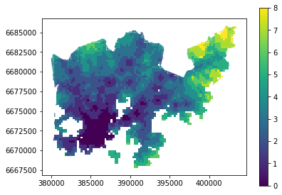
And here we go, now we have a map where we have used one of the common classifiers to classify our data into 9 classes.
Plotting a histogram
A histogram is a graphic representation of the distribution of the data. When classifying the data, it’s always good to consider how the data is distributed, and how the classification shceme divides values into different ranges.
plot the histogram using pandas.DataFrame.plot.hist
Number of histogram bins (groups of data) can be controlled using the parameter
bins:
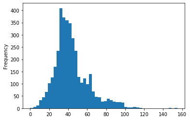
# Histogram for public transport rush hour travel time
acc['pt_r_tt'].plot.hist(bins=50)
<matplotlib.axes._subplots.AxesSubplot at 0x134e1c160c8>
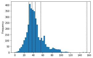
Let’s also add threshold values on thop of the histogram as vertical lines.
Natural Breaks:
# Define classifier
classifier = mapclassify.NaturalBreaks(y=acc['pt_r_tt'], k=9)

# Plot histogram for public transport rush hour travel time
acc['pt_r_tt'].plot.hist(bins=50)

# Add vertical lines for class breaks
for value in classifier.bins:
    plt.axvline(value, color='k', linestyle='dashed', linewidth=1)

Quantiles:
# Define classifier
classifier = mapclassify.Quantiles(y=acc['pt_r_tt'])

# Plot histogram for public transport rush hour travel time
acc['pt_r_tt'].plot.hist(bins=50)

for value in classifier.bins:
    plt.axvline(value, color='k', linestyle='dashed', linewidth=1)
Task
Select another column from the data (for example, travel times by car: car_r_t). Do the following visualizations using one of the classification schemes available from pysal/mapclassify:
histogram with vertical lines showing the classification bins
thematic map using the classification scheme
Creating a custom classifier
Multicriteria data classification
Let’s create a function where we classify the geometries into two classes based on a given threshold -parameter. If the area of a polygon is lower than the threshold value (average size of the lake), the output column will get a value 0, if it is larger, it will get a value 1. This kind of classification is often called a binary classification.
First we need to create a function for our classification task. This function takes a single row of the GeoDataFrame as input, plus few other parameters that we can use.
It also possible to do classifiers with multiple criteria easily in Pandas/Geopandas by extending the example that we started earlier. Now we will modify our binaryClassifier function a bit so that it classifies the data based on two columns.
Let’s call it
custom_classifierthat does the binary classification based on two treshold values:
def custom_classifier(row, src_col1, src_col2, threshold1, threshold2, output_col):
   # 1. If the value in src_col1 is LOWER than the threshold1 value
   # 2. AND the value in src_col2 is HIGHER than the threshold2 value, give value 1, otherwise give 0
   if row[src_col1] < threshold1 and row[src_col2] > threshold2:
       # Update the output column with value 0
       row[output_col] = 1
   # If area of input geometry is higher than the threshold value update with value 1
   else:
       row[output_col] = 0

   # Return the updated row
   return row
Now we have defined the function, and we can start using it.
Let’s do our classification based on two criteria and find out grid cells where the travel time is lower or equal to 20 minutes but they are further away than 4 km (4000 meters) from city center.
Let’s create an empty column for our classification results called
"suitable_area".
# Create column for the classification results
acc["suitable_area"] = None

# Use the function
acc = acc.apply(custom_classifier, src_col1='pt_r_tt',
                src_col2='walk_d', threshold1=20, threshold2=4000,
                output_col="suitable_area", axis=1)

# See the first rows
acc.head(2)
| car_m_d | car_m_t | car_r_d | car_r_t | from_id | pt_m_d | pt_m_t | pt_m_tt | pt_r_d | pt_r_t | ... | to_id | walk_d | walk_t | GML_ID | NAMEFIN | NAMESWE | NATCODE | geometry | nb_pt_r_tt | suitable_area | |
|---|---|---|---|---|---|---|---|---|---|---|---|---|---|---|---|---|---|---|---|---|---|
| 0 | 29476 | 41 | 29483 | 46 | 5876274 | 29990 | 76 | 95 | 24984 | 77 | ... | 5975375 | 25532 | 365 | 27517366 | Helsinki | Helsingfors | 091 | POLYGON ((402250.000 6685750.000, 402024.224 6... | 8 | 0 |
| 1 | 29456 | 41 | 29462 | 46 | 5876275 | 29866 | 74 | 95 | 24860 | 75 | ... | 5975375 | 25408 | 363 | 27517366 | Helsinki | Helsingfors | 091 | POLYGON ((402367.890 6685750.000, 402250.000 6... | 7 | 0 |
2 rows × 21 columns
Okey we have new values in suitable_area -column.
How many Polygons are suitable for us? Let’s find out by using a Pandas function called
value_counts()that return the count of different values in our column.
# Get value counts
acc['suitable_area'].value_counts()
0    3798
1       9
Name: suitable_area, dtype: int64
Okay, so there seems to be nine suitable locations for us where we can try to find an appartment to buy.
Let’s see where they are located:
# Plot
acc.plot(column="suitable_area", linewidth=0);

# Use tight layour
plt.tight_layout()
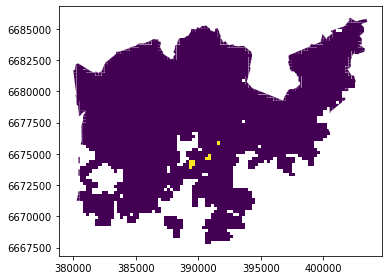
A-haa, okay so we can see that suitable places for us with our criteria seem to be located in the eastern part from the city center. Actually, those locations are along the metro line which makes them good locations in terms of travel time to city center since metro is really fast travel mode.
Other examples
Older course materials contain an example of applying a custom binary classifier on the Corine land cover data.